Around 15 minutes ago, I took my pendrive(which I have not used since late last year) down as I wanted to transfer my newly designed timetable into it to be printed somewhere else.
I viewed the contents and was very surprised indeed. :)
I found files I forgot was even there.
Last year's SSC magazine's editorial contents. :D
Not only I designed many of the pages in the magazine, I was asked to design the cover as well. I did 3 overall and let the board and teachers chose for themselves. So just now, I took a look at the 3 different covers I designed and analysed it a little.
Unfortunately, it doesn't look as nice as I first designed it. :(
Haha the covers are so funny I just have to post it.
Corny and messy are the right words for it. XD
Cover 1 has got dark and gloomy feel to it(at least that was what I wanted anyway).
The eagle is just there for some gaya reason and the contrast from darkness to light should be obvious but it obviously isn't. The forests below are supposed to be the dark side and the top bright area shud be the bright side. Like showing some change in alignment. Darkness to light.. get it? Those kind. Like Seri Cahaya bringing light unto the world. :)

Cover 1
Cover 2 is quite gay. Trying to be unique but didn't work out. The middle scenery section is just too contrasting with the light background. I was told the eagle looks extremely corny here. But wait a minute guys. Just try picturing this as a cover of a school magazine. It'll be freaking cool. I just wanna try man! The color.. first time in SSC history.. Yea..

Cover 2
Cover 3 is very similiar to Cover 2. I just doing it for Kim's sake. She got ideas of her own and wants to put the Seri Cahaya name and logo above instead of below. I don't remember who suggested bringing the 'dark forest' here.. But it just looks plain dumb.

Cover 3
So which of those 3 was finally selected?
None!
=D
Many hours in the computer lab and home each day thrown into the rubbish bin. :D
I'm so pleased. :D
No one informed me. :D
Why am I smiling. :D
I was then told the printing company designed the final cover or something. I was told all 3 covers were rejected for some reason.
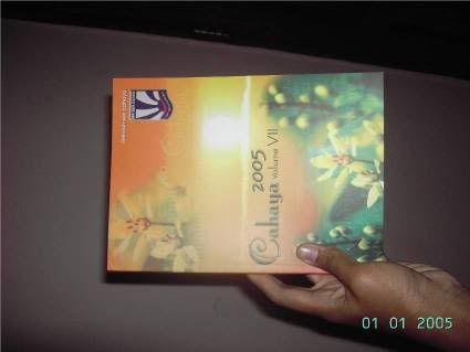
So my final issue of Cahaya school mag which has me in it look like this!

Mag and Haris hand
p/s : I'm not disappointed or angry or anything.. Just frustrated on the fact that no one told me anything about designing a cover or what should be done etc. All they did say was ,"Alex. Design a cover" and I just did my job. No one checked my work until I submitted it. Oklah..to be honest how could I not be affected! Zz. Ok I admit the covers are not very nice but still! Tell me what you guys want wert. Zzz. And no, I'm not blaming anything on the editor. I'm still actually quite glad I did many pages in the mag. Proudest pages are the Editorial Board pages. 10q for ur time. :)
-alexeO-
No comments:
Post a Comment